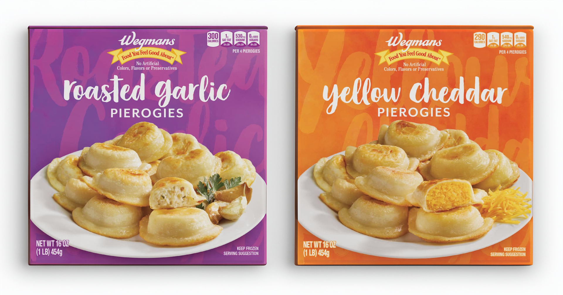
Wegmans entered the frozen pierogi market wanting to compete with more popular national brands. But, Wegmans had more to offer, simultaneously launching 8 different varieties. These varieties had to sit on shelf together and look unified, but be easily distinguishable enougb that the customer wouldn't accidentally grab the wrong flavor.
The client's goal here was to stand out in a unique market. They wanted to look similar to their competitors, but keep the Wegmans charm most families would look for - approachable, fun, and bright. Clean photography and handwritten copy, paired with their trusted Food You Feel Good About banner, helped them carve their place in the freezer section.
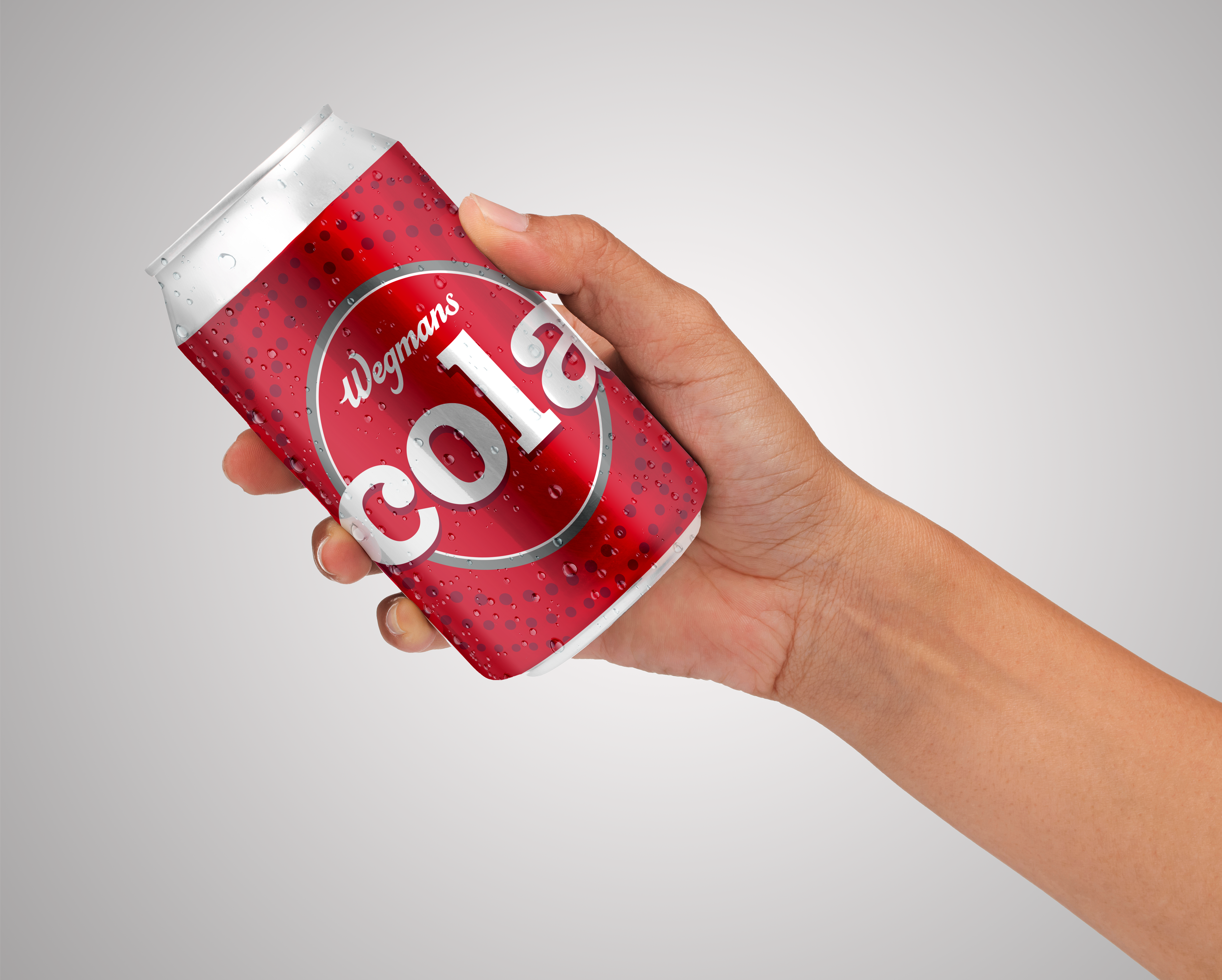
When toying with the idea of re-launching their line of colas (pops, to us Rochesterians), Wegmans wanted to honor the past. WPOP was legendary in many Wegmans markets, even sneaking a guest appearance on The Office in its early seasons. Updating a very 90s brand and keeping the charm can quickly skew to corny, so we opted to throw in some soda pop charm, toning back texture and utilizing classic colors.
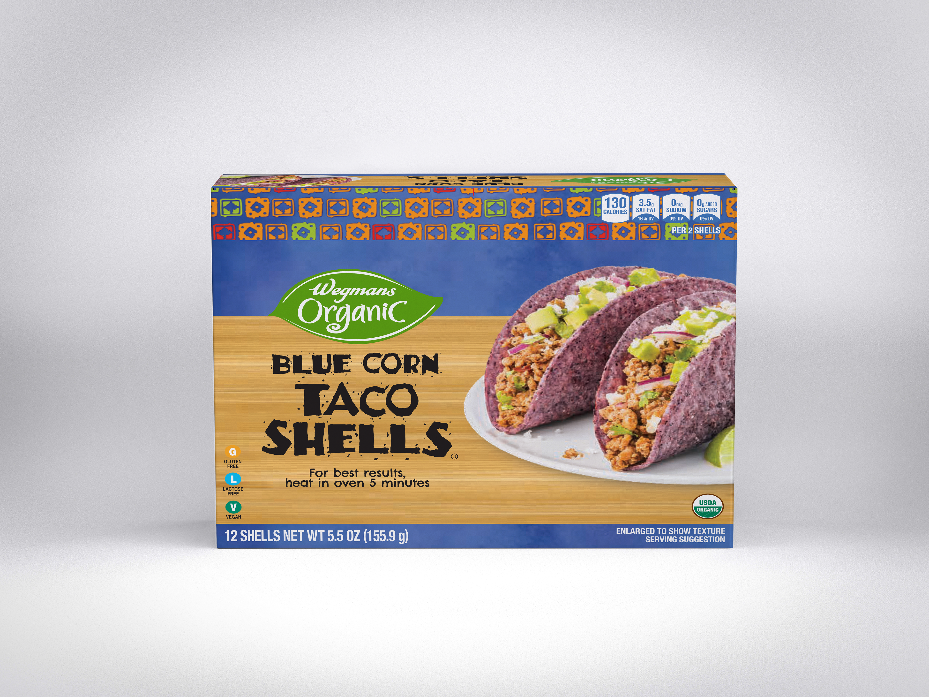
Taco shells are a fun, easy weeknight staple in many households, making this shelf a crowded one. Wegmans already sold a line of Mexican foods, so introducing taco shells was both a matter of fitting in amongst that existing store branding, and standing out amongst competitors. Using established brand textures and fonts, combined with striking, bright photography, made this an easy grab for the Taco Tuesday crowd.