After meeting with the client, I quickly learned how passionate she was about her yoga practice. She also knew what she liked – round shapes, clean lines, and nothing too literal. She was attracted to red, but wanted to avoid fire, hearts, and any overused yoga symbology.
I had to get those literal heart and fire shapes out of my system, though. From there, the real fun began.
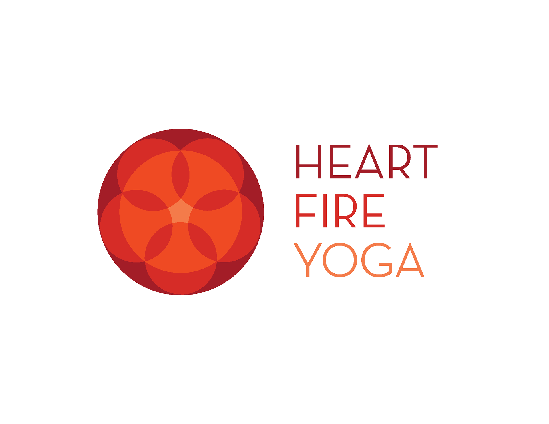
When it came time to conceptualize, I opted to represent Heat Fire through a warm color palette and a series of circles – there are always 5 circles together, representing the 5 Points neighborhood. Keeping with the client's love of minimalism, I was inspired to create a (very) abstract lotus through the overlapping of these circles. My goal was to represent the movement, flow, and togetherness of a community yoga practice through the way these circles interacted.
From here, a final logo was picked and implemented.
